Crédit: extract from Francis A. Walker, Statistical Atlas of the United States based on the results of the 9th census / Library of Congress
How to analyze a map?

Patrice Mitrano
Published on September 4, 2025
Note to readers:
This article is part of a set of methodological resources related to the map exercise required in the Thinking IR globally course at Sciences Po. The « map » is essentially identical to the « geographic sketch » used in high school. Most of the points developed in these resources apply to secondary education.
Describe
First, describe what you see and what you read on the map and around it, with simple words, without trying to interpret or analyze :
- Describe the medium (paper poster, digital map, etc.),
- The type of use (official document, communication element, etc.),
- Find, if possible, who ordered (an NGO, a government, etc.),
- Identify the source from which the image was taken (online map library, magazine, atlas, etc.) or find the author.
Read carefully the map’s background texts (titles, legends, notes, etc.), which often contain several of the elements you’re looking for.
Then, identify spatial distributions: Are there dense or empty areas? What are the orders of magnitude? Are there any overlaps?
Contextualize
Try to date the moment or era during which the map was drawn (geopolitical issues: Cold War, breakup of the former Yugoslavia, for example).
This step is subjective. The map is an eminently political object: the author made choices throughout its design/production :
- The choice of a blank map (projection, framing, orientation, etc.) is already an element of interpretation: why choose a Mercator projection rather than another? Why limit the map to the China Sea alone rather than considering the entire Indo-Pacific region?
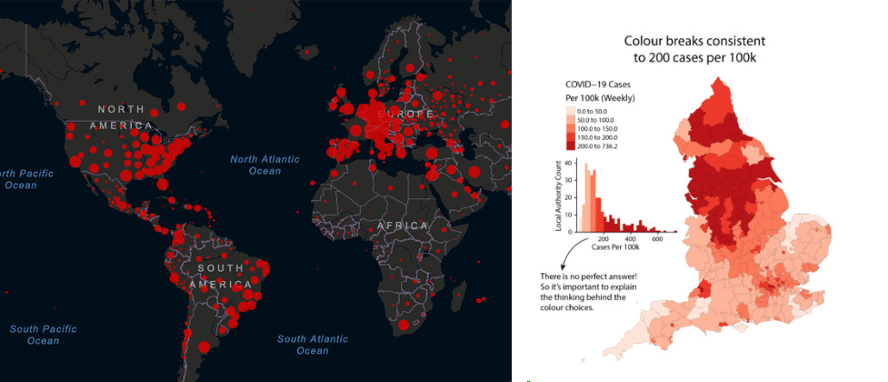
- The choice of the type of data used. We saw this during the Covid-19 crisis: why use absolute numbers and show positive cases by country rather than weighting them relative to national reference populations (prevalence)? The maps don’t show the same situation and interpretations can go in different directions.
- The choice of visualization for an information is often not neutral. Why these colors? Their interpretation varies from one region to another in the world: yellow is a symbol of treachery in the West but of power and wisdom in the East. Are there habits or norms (the Republican Party in red color and the Democratic in blue in the United States)? Why this choice of division of the statistical series and this number of classes?
Illustration 1: (left) World Covid-19 map (source: Coronavirus Resource Center, JHUM, https://coronavirus.jhu.edu/map.html) and (right) Covid-19 prevalence in Great Britain (source: James Cheshire, Next slide please: data visualisation expert on what’s wrong with the UK government’s coronavirus charts, The Conversation, 3 nov. 2020)
Interpret
It is about bringing out the interest of the map, what this map brings to the understanding of the world, at the time it was produced and, why not, with a current perspective. Critical analysis is not a vain deconstruction: on the contrary, we approach the limits of the map by pointing out specific choices of the cartographer or possible omissions that we comment on in a constructive spirit and that we can compare with other maps produced by other authors on the same theme.
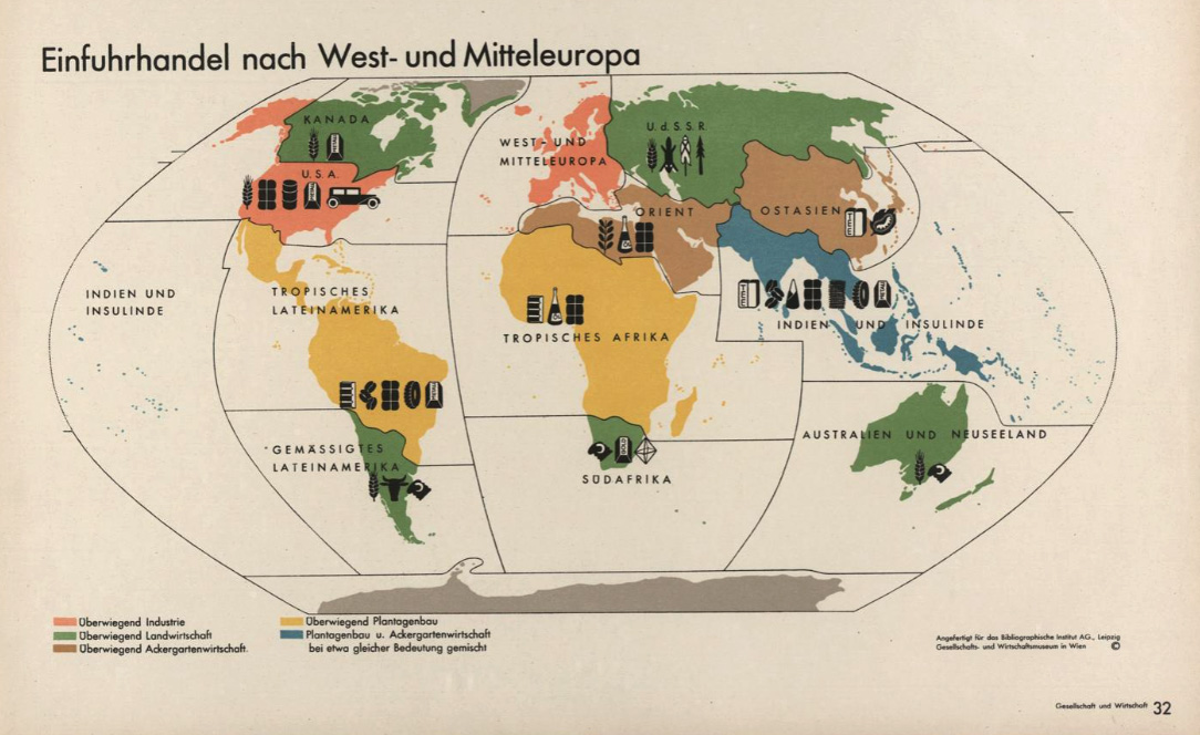
The following map of the import trade to Western and Central Europe is taken from a set of 100 detachable and displayable plates drawn up by Otto Neurath and his team at the Gesellschafts- und Wirtschaftsmuseum, a multidisciplinary scientific and educational research institute. Founded in 1925 in social-democratic Austria, it brought together statisticians, cartographers, ethnologists, doctors, architects and artists. Its activity ceased with the overthrow in 1934.
Illustration 2: Illustration 2: Map of import trade to Western and Central Europe (1930) with a typology of partner regions (different colors) and main imported products (shapes).
Source: Otto Neurath et al., Gesellschaft und Wirtschaft : bildstatistisches Elementarwerk, Österreichisches Gesellschafts- und Wirtschafts-Museum, Leipzig, 1930, p. 32
To go further
- All the ressources in Bien démarrer en cartographie en Espace mondial
- Juliette Morel, Les cartes en question, petit guide pour apprendre à lire et à interpréter les cartes, Autrement, 2021, page 141
- Delphine Allès, Frédéric Ramel, Pierre Grosser, Relations internationales – 2e édition, Dunod, 2023, pages 307-309
- History and Geography textbooks for high school. They often contain good articles on map and image analysis.


