Copyright: Atelier de cartographie / Sciences Po
How to represent a lot of information on a single map?

Patrice Mitrano
Published on September 4, 2025
Note to readers:
This article is part of a set of methodological resources related to the map exercise required in the Thinking IR globally course at Sciences Po. The « map » is essentially identical to the « geographic sketch » used in high school. Most of the points developed in these resources apply to secondary education.
Select data
Representing a single piece of information, or even two, on a single map isn’t too problematic. But as soon as you want to display several pieces, sorting them and selecting the most relevant ones becomes essential.
Tips #1: Select the most relevant indicator to illustrate an argument. This solution avoids redundancies and frees up space to display other data.
Tips #2: Keep only part of a variable (high or low values) to highlight them. For example, color in only countries with a Gini index > 40 to emphasize highly unequal areas of the World.
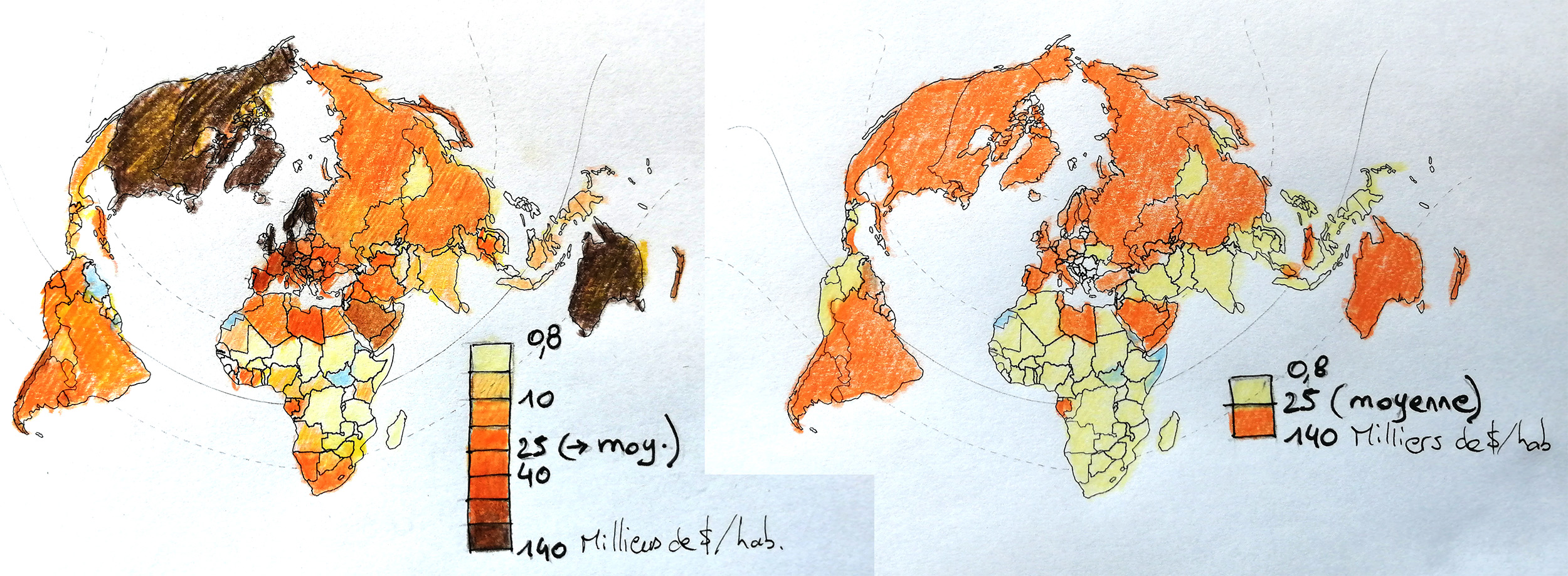
Tips #3: Simplify information, especially if it is complex. For example, reduce the number of classes on a GDP per capita map whose content you want to reproduce: reduce the number of classes from 8 (on the left) to 2, high/low (on the right).
Illustration 1. Simplifying information: GDP per capita worldwide (2020-23 average).
From a complex 8-class map (left) to a 2-class version (right).
© Atelier de cartographie / Sciences Po
Vary data types
The whole art of the map in the course Thinking IR globally at Sciences Po is to make it simple, yet effective, rigorous and usable to answer the question and to communicate. but the image can very quickly become overloaded.
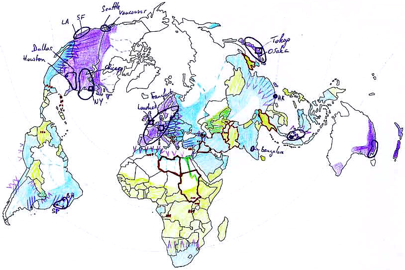
Tips #1: Varying the scales of data makes it easier to draw them on a single map. From very local (at the city level), they can be regional (according to administrative units), transnational (religions or languages) or global (a global warming scenario).
Tips #2: Combine the use of complete data series (GDP per capita for all countries in the world) and selected and therefore non-exhaustive cases. For example, take the WWF Global Biodiversity Index and a case of an endangered species.

Illustration 2. Student work on financial globalization (1996) which alternates information on the scale of states, transcontinental groups or even very localized ones. For a readable result.
© Atelier de cartographie / Sciences Po
Combine/synthesize graphically
The use of clearly differentiated shapes graphically reinforces the diversity of information on the map. Points are generally used to map specific locations, but they can also be used to represent, for example, the few member states of a small regional organization. Lines connect places (refugee flows), associate spaces (regional organization), or, conversely, separate territories (walls or borders). Finally, zones combine data and facilitate their generalization (more or less precise drawing).
These three graphic elements are modular in a large number of colors, geometric shapes, sizes or orientations, and allow multiple combinations.
When we create a map, if we notice that several phenomena have the same geography (the same spatial distribution), we can try to represent them using a single graphic element.
Advantage: we refine the graphics to make the map more “readable”.
Disadvantage: to write the legend, we cannot associate any data together.

Illustration 3. Different pictures showing the same dataset.
© Atelier de cartographie / Sciences Po
To go further
- All the articles in Bien démarrer en cartographie en Espace mondial
- Isabelle Coulomb, « Portrait : je suis la sémiologie », ICEM7, 24 décembre 2020
- Christine Zanin, « Figuration cartographique », HyperGéo, 25 mai 2006

